Monday, December 22, 2008

Hedgie love


I made these onesies the other day for our friends' baby on the way. Fun with iron-ons!

Treeswing Jumps!


Here's a recent invitation package I designed for Treeswing. It's for an event in January—a live performance by a professional jump rope team and a showing of the film Jump! I have a feeling these kids are way more advanced in the jump rope department than I ever was. The invitation package supports Treeswing's existing brand along with some new imagery and illustration.

Tuesday, December 16, 2008

A sweet stocking stuffer


Here's a necklace & earring set I was commissioned to make for a holiday gift. So as to keep it a surprise, I'll just say it's for someone very special. :)

Monday, December 08, 2008

December Day


We've had a really mild winter so far here in the Northwest—in fact there are still leaves on some of the trees and flowers are blooming. The little birds have been all a twitter around the thistle feeder lately—always happy to discover a free lunch.

Wednesday, December 03, 2008

Sneak peek, take 2


I'm excited about this promo I'm working on–it's not too often I get to be my own client! Here's another tease...

Monday, December 01, 2008

Sneak peek…


Here's a peek of something I'm cooking up for the new year. Hmmm, what could it be? Stay tuned...

Wednesday, November 26, 2008

Happy Thanksgiving (& please pass the turkey)


Finally, I've got an excuse to show off my sweet greyhound Murray. Here he is modeling a scarf I knitted up the other night using size 50 needles (!) and Lion Brand 'thick & quick' yarn. This yarn definitely lives up to it's name. Thanks to the jumbo sized needles and thick yarn, I cranked this scarf out in an evening of TV watching. I hope everyone has a cozy Thanksgiving!

Tuesday, November 25, 2008

Museum of Science, Boston


Here's another recent collaboration with Plural. This project is a 36 page magazine for the Museum of Science in Boston. There is also a concise annual report inserted into the center of magazine. The audience is members and donors so it is chock full of the many exciting things going on at the museum. As with the Brandeis project, I was given well thought out brand standards to work with—a recently updated logo, font and palette selection. It was my job to take those elements and design a magazine that reflected the museum's character and quality. So if you're in Boston, check out the museum—you'll see Triceratops Cliff, one of only four nearly compete Triceratops on public display anywhere in the world!

Monday, November 17, 2008

Shopping for something special?


The holidays are just around the corner! If you happen to be stumped on what to give to your someone special, I'm happy to create a unique piece of jewelry for you to slide under the Christmas tree. Here are a few pieces I've done in the past, and while these are no longer available, I can make new pieces based on your color and style preferences.

Friday, November 14, 2008

Brandeis Anthology


I recently partnered with Plural, a Brand Strategy and Design consultancy in Boston to design a 70 page anthology for Brandeis University. The collection of essays are written by academics on the subject of Jewish Experiential Learning—in other words, stepping out of the classroom and learning by doing. I really enjoyed working on it for a few reasons. The University has an existing brand that is well-designed and allowed me to build upon it. I also had really great photography to work with, which is not always the case. For this project, after reviewing every essay, I recommended photography styles and content that would support the text. The cover was printed in 4 color process, while the rest of the book is only 2 inks–blue and brown—however I used the two inks in a variety of combinations to really push the results. A lot can be done with only two inks! Above are a few spreads from the book.

Friday, September 19, 2008

Stay tuned...

I've been a little negligent when it comes to updating my blog, but trust me I'm not slacking off—I'm just busy with work! Currently I'm partnering with a design firm on the East Coast which has been keeping me busy with an 70 page anthology and a 36 page magazine. Hope to have those wrapped up in the next couple of months so I can share them. Also, I'm happy to say that the signage system I designed for Bertschi School will be installed any day now—so once it's in, I'll photograph the results and blog about that fun project. More to come...

Green Your Halloween!


It's hard to believe but October is right around the corner—the grey skies and changing leaves guarantee it. So if you're like me, you're already thinking about carving pumpkins and getting visits by cute (and sometimes spooky) trick-or-treaters. Green Halloween, a local organization and a program of Treeswing, is thinking about it too and wants you to consider giving out other fun stuff instead of candy. I know how crazy that sounds, being someone who is mildly obsessed (ok, majorly obsessed with chocolate), but trust me—your kids and their parents will thank you! Last year we went with the the Green Halloween plan and handed out stickers, play-doh and temporary tatoos and the kids were thrilled. I recently designed this Green Halloween action kit which is full of ideas, recipes and other fun stuff to get your family on-board. Hope you have a happy (and healthy) Halloween!

KCSARC: End the silence


Mark your calendars for another worthy cause on the horizon for 2009: KCSARC's annual 'Kids Are Our Business' breakfast on Tuesday, February 24th. This one is their 20th anniversary and will be an opportunity to hear moving testimonies of how they have helped many sexual assault victims in the King County area. This is the second year that I've designed their event materials and again, the artwork is created by one of the children they have helped. For more information, visit their website here.

Tuesday, August 26, 2008

Treeswing


Did you know that 1 in 3 children is overweight? Or that obesity will soon top tobacco as the most preventable cause of death? Scary news, isn't it? That's why a local non-profit is doing everything it can to get the message out that eating healthy and being active are crucial to the lives of our children.
I recently partnered with Treeswing to develop and design their new donor materials. Their existing brand was extended to the gatefold brochure along with new images that convey the spirit and energy of the organization's mission: to help kids lead healthy, active lives. We printed the piece on an environmentally friendly stock, Mohawk Via pc cool white which is 100% post consumer waste paper manufactured using wind-generated electricity.

Tuesday, August 19, 2008

Upcycling cuteness


What do you do when you've created something you really like, but the client doesn't? Use it for something else to make something new or as some folks would say: upcycle it! I took an illustration I recently created for a client and used it for my favorite one-year-old's birthday card.

Thursday, July 24, 2008

Lady Lam


Don't you just love stories of people quitting their 9 to 5 jobs to follow their true passion? I think it's something we all dream about, but few of us actually have the nerve to go through with it. That's why I was so happy to help my friend Christine with a logo and business card design for her new endeavour. She had a great start and a clear vision of what her logo should convey: nostalgia, glamour and good, old-fashioned customer service. As you can see, the updated logo has a fun vintage feel with a modern palette, perfect for her new business (opening September 1st).

Monday, July 14, 2008

More from the garden


Although my work load right now is busy (which is great!) I've been sneaking out to the garden for more sketching when I can. The summer months here are so short, you have to enjoy them while they last. The other day I tackled Bee Balm which to me looks straight of a Dr. Seuss book. I planted it last year and this year it has completely surprised me with its size and color. Initially I tried to draw it very realistically but it is so detailed, I quickly realized this lady had to be stylized so I changed gears and got much looser with it. The hummingbirds and bees adore it.

Monday, July 07, 2008

From the garden


After brainstorming for a client's project the other day, I sketched one of the echevaria babies I started that is now getting pretty big. I drew the black outline with pen as one continuous line (not lifting it up as I drew). Then I went back with colored pencils and tried to capture all of the different colors in this little guy.

Tuesday, July 01, 2008

Home comforts


I haven't shown too much craft on my blog yet, it's been mostly design work. So here's something I made the other day. I've been looking for cute pillows to use with our outdoor furniture during these precious few months of Seattle summer but hadn't found any. So I decided to overcome my fear of sewing in zippers and make my own. Zippers are actually a lot easier than I thought and thanks to this handy YouTube video, I whipped up four new pillows last week. The patterned fabric is 'Midwest Modern Moss Martini' by Amy Butler which was inspired by 'beautiful summer days in Amy's Ohio garden'. Being a buckeye myself, maybe that's why I was drawn to it! Once I put the pillows out in their garden environment, I discovered how similar the combination of the two fabrics is to one of my favorite plants, the euphorbia. I could have a whole garden of euphorbia and be happy.

Vitality


Here's a business card design project I recently completed for a naturopathic physician. I'm really pleased with the results and hope she is too. The design of the cards needed to be: professional, trustworthy, organized, and nurturing. Aesthetically, she wanted it to have a modern, yet organic feel. The botanical drawings of lemon balm and licorice create a pleasing wallpaper effect, and are symbolic to the naturopathic field. To keep costs down we printed them with an eco-friendly online printer.

Wednesday, June 18, 2008

Hey Mr. Postman...


So who else besides me is excited about the new USPS issued stamps honoring the work of designer duo couple of all time, Charles and Ray Eames? We just got ours today and they are lovely. So much so, I almost hate to use them. Good thing we ordered two pages of them! I might just have to keep one. Get yours here while they last (and before the rates go up again).

Thursday, May 29, 2008

It's here!


Art with Heart has just released it's latest publication, 'Magnificent Marvelous Me' and it's chock full of engaging activities and amazing illustrations to benefit children who have a sibling with a disability or serious illness. I'm honored to be a contributor to the project. Learn more here.

Tuesday, May 20, 2008

Texture 101


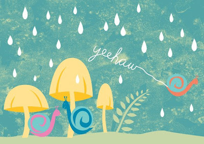
When I'm working on an illustration, I try to include handmade and organic elements so that the illustration doesn't feel entirely created in the computer. I think it gives it a more unique, more imperfect feeling. That could mean drawing or painting and then scanning it in to use, or perhaps scanning fabrics, paper or other found objects. This example is an illustration I did that needed some texture to it so I took the left over coffee grounds and dropped them around on a piece of paper, then left it out in the sun to dry. The next step was to scan it in and adjust the contrast, then take that file into Adobe Illustrator which is my absolute favorite program for drawing. In Illustrator the texture was then colorized and layered into the background of the snail party which gives it more depth and interest.
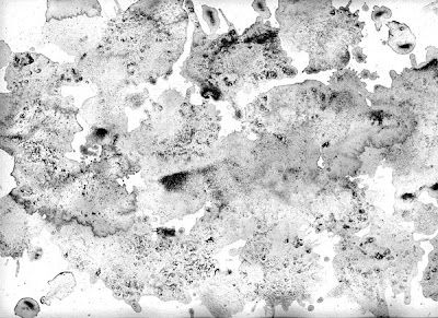
The top image is the texture I made and the bottom image is the finished illustration.

From the archives


Last year I designed this invitation for a fundraising event to support Children's Hospital. It needed to be friendly, but elegant and print in two colors to be cost effective. I used the Eames Furniture Weave Finish in Pacific Blue which was also used to create custom mailing envelopes.

Friday, May 09, 2008

Mark your calendars!


Even though the weather here in the NW sure doesn't feel like it, I'm pretty sure Summer is right around the corner. That means flowers will be popping up in full bloom and I'll be sporting my dirt manicure. It also means that the Georgetown Art & Garden Walk is coming up! That's right, before you know it, folks will be oohing and ahhing over all of the fabulous gardens and studios in the Gtown neighborhood. I've done my second poster design for the walk and due to popular demand, the chicken has returned. This time she's roosting on a nest of flowers and straw. So mark your calendars for the walk, Sunday July 13th, 10 to 5. Free maps are available the day of the event at the Bank of America parking lot.

Tuesday, May 06, 2008

Sightline


I recently created some web banners for my client Sightline to use for their spring fund drive. I kept them simple, but included fun spring graphics that complimented their existing branding. If you would like to have a part in creating healthy, lasting prosperity in the Northwest, visit their website.

Friday, May 02, 2008

My lucky day

I found out that the Revival identity and business papers I designed just won silver in Neenah Paper's Paperworks First Quarter Letterhead Contest. How exciting! In addition to the recognition, I won a $300 MasterCard gift card. Hmmm, now to decide what to spend it on...

Thursday, April 17, 2008

Letterpress printing


In 2007 I did an identity project for La Luz Photography. My client wanted a logo and business card design that were sophisticated, classic and conveyed elegance—all qualities of her photography. She was also in love with letterpress because of its rich, tactile nature. We chose a lovely brown and robin's egg greyish blue for the color palette. At that time I didn't have my press up and running so we printed them at Bison Press in Bellingham who did a fantastic job.

Saturday, April 05, 2008

Art with (lotsa) Heart


The other day my dear friend Steffanie of Art with Heart asked me to create a page for one of her latest books. This book will be similar in look and feel to Oodles of Doodles, but this one is for the siblings of children diagnosed with serious or debilitating illnesses. It will be a therapeutic activity book which will focus on meeting the emotional needs of siblings dealing with a wide range of confusing emotions. The page I illustrated is a board game that will help the kids engage with others in their circle of support and help reduce isolation. If you would like help to make this project a reality, visit here. It's a wonderful organization and I'm honored to contribute to the project.

Monday, March 31, 2008

Sprout


Lately I've been feeling like the metaphorical seeds I've been sowing over the past year and a half are starting to take root. I've been getting calls, referrals and keeping busy with both old and new clients. I look forward to the new opportunities Spring will surely bring its way. As for seeds of the literal type, it looks like the sunflowers and the heirloom tomatoes are the early achievers of the season.

Friday, March 21, 2008

Welcome Spring


I'm sure I'm not alone when I say 'Welcome Spring'! Winters here in the NW can tend to be a tad grueling although this one wasn't too bad, but nonetheless I'm ready for longer days, sunshine and working in my garden.

Time to shop


Revival is now open for business in Georgetown! Check it out. 

Thursday, February 28, 2008

Cut + paste


When I started my own business just over a year ago, one thing I really wanted to push myself to do is more illustration. I like not having a specific illustration style, rather I try different techniques, mediums and materials—creating some parts by hand and then working with them on the computer. One of my clients is Cozi, which offers a free software service for busy families to stay in sync. I've done some interface design for them, but when it came time to do some printed collateral, we decided to use an illustration of a family rather than generic stock photography. I created the image used on this piece with cut paper and fabric—it gives it a kid feel, appropriate to their audience and the circular motif picks up on the Cozi branding.

Tuesday, February 12, 2008

Letterpress success


About a year ago I acquired something that I've wanted for awhile—my very own letterpress. It's a C&P Pilot Press, which is a table top platen press originally manufactured for schools. As eager as I was to get the press, it has taken some time to get it up and running—between keeping up with my design projects and figuring out how to work it, its been slow going. A 50+ year old piece of equipment doesn't exactly come with a user's manual (although I have been discovering an impressive amount of information online). There are many diehard old timer pressmen out there, as well as a whole generation of enthusiastic newcomers. I originally planned to print mostly with polymer but now I want to experiment with some linoleum cuts. I have a few pieces of old wood type which give a lovely impression, hopefully I can add more to my collection. I just finished my very first project—my business cards. There was some trial and error of course, but as with most things it's a learning process. My letterpress mantra continues to be, "It's an art, not a science."

Friday, February 08, 2008

Logo makeover 101


From time to time we could all use a little spiffing up of our appearance. We might not even realize it until a friend points it out. For example, your girlfriend might say (nicely), "Do you know you've had the same hair style since 8th grade?" Or, "Just because you ARE a mom, doesn't mean you should be wearing those mom jeans!" It's those little things that we might never notice ourselves, but once you make the change you see what a huge difference it makes. Sometimes a logo needs a makeover too. It may not need a complete rebranding, but just a little tweaking here and there to make it work better. When a brand has equity and is recognizable, it makes sense to not reinvent the wheel. I worked with Treeswing, a Seattle based non-profit to improve upon their already good identity. The logo had a couple of challenges: in order for the tagline to be legible the tree had to be huge. Although it was two colors to begin with, they were not used in the best way possible. I adjusted the logo by scaling down the tree and using two more distinctly different greens to emphasize the human figure inside of the tree as well as the organization's name. This allowed for the tagline to be larger and be more legible. See what a big difference that just a few 'tweaks' can do?

Tuesday, February 05, 2008

Classic yet modern


When a client says they know exactly what they want before the project even begins, a red flag starts flapping away in my mind. That is because unless they have an understanding of marketing, design and branding—what they envision is probably not going to be what I think is a good solution. But every so often I have a client that 'gets it' and they are a joy to work with. Recently I partnered with Leah Steen who is opening a fresh, stylish and affordable home store in the Georgetown neighborhood of Seattle. If you've been to Gtown lately, you've noticed change is afoot there and I think Leah is one smart lady to be setting up shop. With a freshly signed lease lighting the fire, we moved fast and developed the brand for her store 'Revival' which will open Spring 08. She had a vision of a modern brand with classic, elegant roots. After looking through vintage type specimen books for inspiration, I chose a contemporary typeface 'Neutraface' which was based on signage designed by architect Richard Neutra. I printed her business papers on a recycled stock: Classic Crest Recycled Bright White which comes in a nice hefty 130 double thick cover weight, perfect if you want a substantial feeling business card.

Wednesday, January 30, 2008

A 'taste' of the Market


If you've ever been to the Pike Place Market in Seattle then you know it's a colorful, jam-packed place full of history and so many flavors to sample that it's nearly overwhelming. That's why the founders of Taste Pike Place started their business—to show visitors the nooks and crannies the Market has to offer from a local's perspective. I developed the brand and marketing materials to be fun, friendly, colorful. We decided from the start that the materials should utilize illustration rather than photography to give their brand a unique look and feel. Familiar icons from the market—fish, fruit, wine and coffee (of course)—give the viewer a taste of what's to come when they take one of the fabulous tasting tours they have to offer.

Tuesday, January 29, 2008

Building a brand


Creating a brand for a new business is always exciting, particularly when it's for someone putting their heart and soul into the effort. When my friend Beth Cullom asked me to partner with her to develop the identity and business papers for her new art gallery I was happy to help. As a small business owner myself, I know keeping costs low is important when you're first starting out. I set out to design the materials as economically as possible, but still make them elegant and have elements of Japanese printmaking. Everything was printed on one of my favorite environmentally friendly papers: Neenah Environment PC White in one ink only. I had a stamp made of the little bird I designed which Beth uses to add an accent of red to each piece, showing a custom touch to each piece of correspondence from Cullom Gallery.

It IS easy being green


It's my lucky day when I have a client that is not only easy to work with, understands good design AND has a commitment to environmental concerns! I recently partnered with Bertschi School to create a brochure that complimented their new recruitment brochure. This new 'sister' brochure is all about their commitment to Sustainability & Diversity. Bertschi is an amazing school—energy, enthusiasm and enlightened thinking abound. I really admire clients that understand doing their part for the environment is not only good for the planet but also for their brand. It shows that they are forward thinking and respect the triple bottom line: planet, people and profit. We printed the brochure with an FSC certified printer with soy ink on FSC certified 100% recycled post-consumer waste paper (Neenah Environment PC 100) that was manufactured with 100% certified renewable energy and without the use of chlorine.
Blog Widget by LinkWithin